Webinar registration page: 9 things you cannot miss
Learn what a webinar registration page is, and the things you need to have people register to your webinar. Let's explore how you get a ton of signups for your next event.

Introduction
Webinars are a big deal for B2B SaaS companies. They're a chance to show off your product, share knowledge, and connect with potential customers. But to get people to show up, you need a great webinar registration page.
This guide will break down the must-have elements of this page, making it easy for your audience to sign up and get excited about your event.
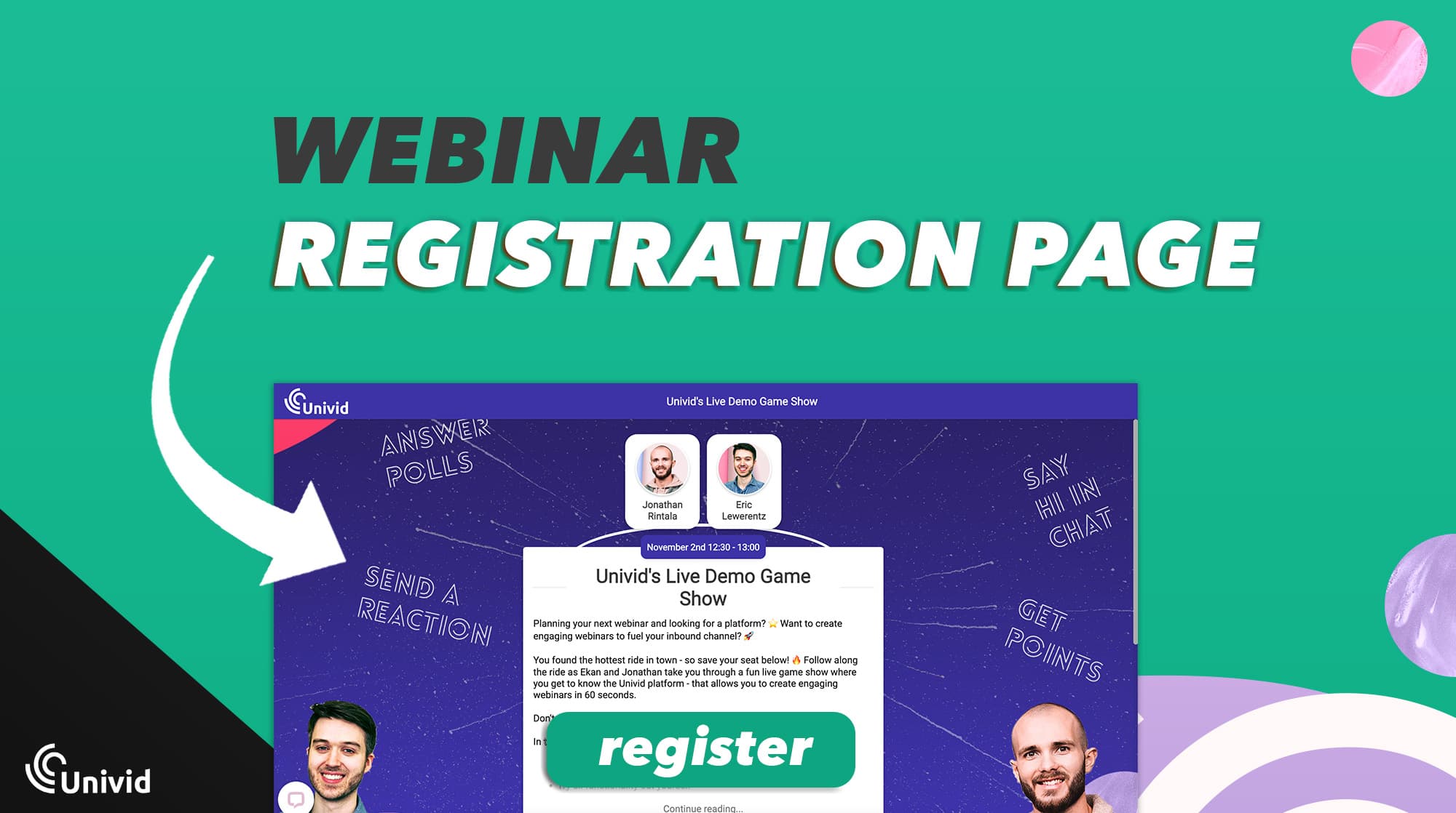
What is a Webinar Registration Page?
Think of a webinar registration page as the front door to your event. It's where people go to sign up, learn what the webinar is about, and decide if they want to join. A well-designed page makes this process smooth and gets more people to click that "Register" button.

Also, for inspiration - check out the list of the best 7 examples of webinar landing pages (to copy).
9 Key Components of a Webinar Registration Page
1. Catchy headline
Your headline is the first thing people see, so make it count. It should grab their attention and quickly tell them why your webinar is worth their time. Keep it short and sweet.

Ps. use ChatGPT to feed you with ideas. But you will need do a lot of prompting and re-write to authentic and crispy copy that makes your ideal target audience sign up.
2. Cool visuals
Pictures or graphics make your page more inviting. Use images that fit with your webinar's theme or show off what attendees can expect to learn.

A good visual says more than 1000 words - which no one will read anyways. Introduce visual element - make your page pop and keep visitors interested.
3. The boring basics
Here’s where you tell everyone the webinar basics and details to attend:
Date and Time: Make sure it’s easy to see when the webinar is happening, and don’t forget the time zone.
Duration: Let people know how long they'll be tuning in.
Agenda: Give a quick preview of what topics you’ll cover to get attendees excited.
Language: If you are operating in local markets - specify the language you will use.
Ps. if you use a different webinar platform - let the audience know which one and what they can expect. How do they join?

4. Speakers section
Show off your speakers! Include their names, what they do, and a little about their background. Photos help attendees feel more connected and shows you’re bringing in the experts.

Also, if you have external guest speakers - make sure to include company name so it's clear where they come from. This is a great way to add diversity, trust and expertise to your webinar.
5. Simple registration form
This is where visitors sign up, so keep it easy. You’ll usually need:
Name: Who’s attending?
Email Address: Where should we send the details?
Company and Job Title: Great for tailoring follow-ups, enrich the CRM and qualify your leads.

Too many fields can scare people off, so stick to the basics. Unless you have some MAJOR value bomb you know your audience can't keep themselves away from.
6. Eye-Catching Call-to-Action (CTA)
Your CTA is your "Register Now" button. Make it big and bold so no one misses it. A contrasting color can help it stand out from the rest of the page. Also, CTA:s could be in text form - prompting the registrant to "save their seat", or "signup now".

7. FOMO element
Spark a sense of urgency by highlighting the exclusivity and limited availability of your webinar.
Use phrases like "Seats are limited – secure yours now!" or "Don’t miss out – this is a one-time event!" to create a FOMO (Fear of Missing Out) effect. This is basic psychology - but it works.

It takes your target audience out of status quo zombie scroll mode - encouraging taking action (improving your registration rates).
8. Social proof
If you’ve got great reviews, credible partners, industry awards, or big customers cases - show them off! This builds trust and shows newcomers that your webinars are the real deal.

Insight: Webinar hosts report higher conversion rates when including guest speakers from their customer pool, or domain experts.
9. Privacy info
Quickly let people know that their data is safe with you. A link to your privacy policy should do the trick.

How do I create a webinar registration page: 6 steps
A webinar registration page can be created in 6 easy steps:
1. Choose platform
Some companies like to keep webinar registration on their own domain - using HubSpot forms, Wordpress forms, or similar, but a lot of companies that host webinars frequently also see the need for more dedicated tools where they can both manage their registrations, events, communication, etc.
One of the most common challenge is specifically A. managing signups and B. personal links ie. knowing who attended or not - together with other engagement related data on attendee level.
That is something a proper webinar tool like Univid, together with an Event Management System like Lyyti solves. In Lyyti, you can run both registration pages, email communication pre- and post the webinar, payments, analytics and much more. It also seamlessly integrates to Univid:s webinar platform where you can host the engaging live webinar via the Univid x Lyyti integration.
2. Set webinar topic
As you know - a catchy headline is key. It's your hook. Grab the attention of your potential registrants by putting effort into a solid webinar topic.
3. Put together the basics
You now need to set up the basics. The info about who will be talking, when the event takes place, what the length of the webinar is, and the language it will take place in.

Also, add some nice visuals to make things pop.
4. Set up your form
Once you are done with the basics - decide how much info you need to collect from the audience.
Collect enough info that you can target the attendees with personalized communication, and that you get enough data to feed the sales team with (or CS if you are running educational webinar). Weigh against what the attendees will be willing to fill out to attend.
For B2B webinars where the leads might be heavily invested and interested in your particular offering and webinar, you can get away with asking a bit more information - like the example below:
")
Example of webinar registration page form
But also - ask yourself the hard question: is you webinar really that special? If no - 1. try to make it, 2. reduce the required info you ask for in return. The minimum basics you should ask for include three things:
First name
Last name
Email
5. Nail the CTA
It's now time to define what will make the potential registrants become registrants by pressing the golden "sign me up" button. What will be the CTA that makes them convert, given the info you want to ask for above.
Apply some basic psychology and put yourself in their shoes. Is it the guest speaker that makes this event special? If so - mention her/him. Or the neatly packaged info they will get in an e-book afterwards? Or maybe each attendee gets a fun piece of merch.
A successful way to get more signups is to make it exclusive and make the registrants feel FOMO. For example, mentioning "seats are limited", "only 2 seats left". That gets people converting, also in B2B.
6. Decide on post registration communication
How will you communicate with your webinar registrants?
Once your registrants signup in your form, prompted by your enticing CTA - they should be met with some confirmation - typically both a redirect to a "thank your for registering" page, or a message. They should also receive the following to their email inbox:
Confirmation email: preferably branded confirmations with "add to calendar" buttons and a "join webinar" button
Reminder email(s): up to 3 webinar reminder emails, also with branding, "add to calendar" buttons, and a "join webinar" button
Note: it's important to send a personal link out to each registrant - so they are tracked and you know who is who when people attend in the data afterwards - without having to ask them to log in again. Platforms like Univid x Lyyti takes care of this automatically.
Conclusion
Your webinar registration page is key to getting a crowd. By focusing on these essential components, you can create a page that’s not only informative but also engaging. Remember, the easier and more inviting your page is, the more people will want to join your webinar. Stay tuned for more tips on making your webinars a hit!