The ultimate recipe for a webinar registration page that leads to converts
Like in other areas of your business, there are ways that you can foolproof the preparation needed for your webinar to ensure success. In this article, we will go through the ways in which you can create a registration page for your webinar that will wow potential attendees, converting them into confirmed attendees. Let’s go! ⭐️
Contents
When thinking of promoting your webinar, you’ll undoubtedly come across the fact you’ll need a registration page for people to sign up to in order to attend.
You can think of this as an opportunity to begin marketing the event from the very beginning- even before they attend. In order for people to be willing to join your webinars, you must make it seem interesting for them from the very first second.
A well structured and designed webinar registration page works like a business card for your business- it should be appealing visually, fast catch interest, include the most important and practical information, and above all else, in no way put anyone off attending.
What is a webinar registration page, you ask?
Well, it really does what it says on the tin.
A webinar registration page is just a simple form that collects information from an individual who has registered for one of your upcoming webinars. It’s usually essential for people to complete a page like this in order to attend an online webinar, and it’s easier and more professional to keep track of attendance this way.
These forms can do more than track attendance, however. They can also ask questions to help the speaker and attendees better understand the needs of the participants and to help to create a productive and effective webinar for everyone involved.
Webinar registration pages can also often contain personal information from the attendee, which is valuable information- their contact info like name, email, and phone number, as well as whether they are attending as an individual or an organization. Registration pages can be a fountain of knowledge for your business, providing you play your cards right.
And having their contact details, whether or not they end up attending your webinar, is still a plus- it’s still a lead.
Let’s move onto the look of the registration page. Yes, the webinar registration page is simple, but that doesn’t mean it has to be boring.
Think of it as an excuse to make a good first impression to your potential guests and really give a taste of what your brand is like. Plus- if your webinar doesn’t stand out, or looks messy, it may deter people from registering altogether, the last thing you want!
If you want to generate more registrations for your webinar, you will need to distinguish yourself from the competition and ultimately provide the best experience possible for your attendees.
Here are our tips on how to make your registration forms stand out from the crowd.
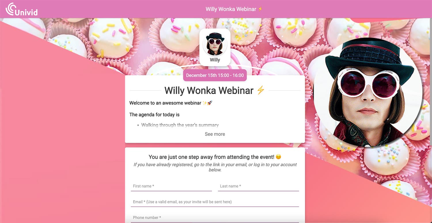
1. Personalize your registration forms and design the landing page ✍️
To increase your webinar conversion rates, the webinar registration page is where you should start, looking at how you can cement your appeal.
To do this, create a custom webinar registration page that will help your prospects instantly pick up an understanding of your content and how it can benefit them. Make sure to design and brand your landing page to set a professional tone, coherent with your brand, and make the webinar inviting to signup for.
Since modern marketing means offering prospects personalized sales information, webinar registration pages that involve personalizing information from prospects are essentially those that bring most sales. Remember to keep the form itself short and sweet - with each new field being an additional barrier for your potential event attendees.
Also, make sure to choose a reliable webinar platform provider - that allows you to customize and design your registration pages (or integrate with your own)!
Check out below what it looks like setting up a registration page in Univid - customizing the signup for in a form builder (or integrate with your own forms, or CRM/marketing system).
2. Show how your webinar provides value to them ⭐
Start off by providing a 1-2 sentence explanation of why attendees should come to your seminar. Put yourself in their shoes and think of what would make you more confident to sign up and join an online event.
When you create your registration form, include something that can act as an incentive, that thing that will push them from being slightly interested to feeling they have to absolutely sign up.
Make them see the bigger picture of why they should attend your webinar so they will feel like it’s worth their time.
Write about how they will benefit from attending, such as expert guest speakers in their field and what you will be sharing during the webinar that they absolutely can’t afford to miss.
3. Don’t leave out clear call-to-actions 🎯
During the webinar registration process, it's important to emphasize your call-to-action. A Call to Action, or CTA for short, provides a concentrated collection of information that allows attendees to quickly decide whether or not they want to invest in your webinar. Is there something that makes your product stand out among the competition? Make sure to mention it.
Link to an informative and fun video of your products to share on social media, or maybe invite them to receive a free sample from you.
Strategies like this will further drive people’s interest and will make them want to participate in your online event asap.
4. Communicate clearly on the date and time of your webinar 📅
Besides the CTA and customization, don’t forget the practical information. You need to keep your potential audience informed in terms of the date, time and location of your webinar, if you want it to be well-organized. Keeping people informed with enough time means they can also take steps needed to attend your event, like booking a babysitter or catching the earlier train home from work and so on. Always be clear about these things and try to stick to them!
Don’t go changing the date and time- it will only result in confusion and mix ups.
On your registration form, display this necessary information clearly. Suggest adding the date and time to people’s google calendars. If they do so, they will feel much more obliged and committed to participate.
5. Integrate your email service, or marketing automation system, and your registration page 🤖
With our modern world, most people are used to our machines and technology doing everything for us. So even signing up for a webinar can feel like a lot of hassle. It's often not easy to find the time, and many people feel like they're too busy with work or other things in their life.
Integrating your email service to your webinar registration page is a powerful way to save customers a lot of time and help grow your mailing list without a ton of effort. Or, conveniently use a webinar platform like Univid that offers email reminders and confirmations (or integration to your favourite services)!
Online webinars can be complicated for participants who are unfamiliar with the process, especially if you use a platform not suited for the case. If requiring an account to signup - as soon as people register, many might forget their password or need to change their confirmation email address. By simply sending confirmation emails with a magic link to access to webinar, you make it much easier for people to participate.
And remember the golden rule - the easier you make things for your participants, the less likely they are to procrastinate and the more likely they are to participate.
6. Make the registration page easy to share on social media platforms 📣
Don’t underestimate the power of social media when you design your webinar registration page. If you want people to be aware of your webinar- make the registration page shareable to social media.
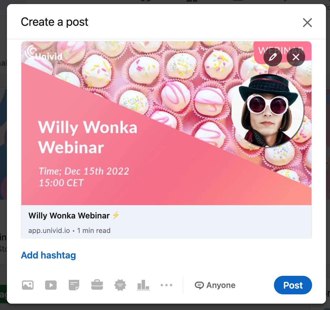
In Univid's webinar platform you can fast generate a sharable image that pulls your event data and make it into nice looking graphics that you can easily share just via the registration page link, or download and upload on your own to promote your webinar!
Check out the shareable image below for inspo:

People are bombarded with notifications from Facebook, Instagram, and Twitter. You want their attention for as long as possible, which means you want to make it as easy as possible for them to share your content.
Luckily, it’s not a complicated process- all you have to do is add a ‘share’ button to your webinar registration page.
Conclusion
You may not think so, instead focusing too much on your guest speakers or script, but your webinar registration page is actually the most important page in your funnel.
As one of the first touch points to your webinar prospects - the registration page sets off the chain reaction: if people aren’t curious or engaged or wowed by your registration page, the first thing they see before the webinar, they won’t opt in, and consequently, they won’t attend it and follow your brand or buy your product.
Rather than waiting to create your webinar registration page right before your marketing/social media campaign or creating it last minute, make it into one of the first and most crucial thing you do - look to become a master at creating landing pages that convert and you will see huge outputs from your webinar efforts!
Get started todayJoin over 70,000 users and create unique webinars with Univid.Show me a demo