7 bästa exemplen på registreringssidor för webbinarier [att kopiera]
Exempel på de bästa registreringsidorna för webinars för att maximera registreringar och anmälningar. En registreringssida kan avgöra framgången för ditt webinar. Här är vad du bör tänka på. Och 7 exempel att kopiera.

Vad är en webinar-landningssida?
En webinar-landningssida är en dedikerad webbsida utformad för att marknadsföra ett kommande webinar och uppmuntra besökare att registrera sig. Sidan innehåller vanligtvis viktig information om webbinariet, såsom ämne, datum, tid, talare och fördelarna med att delta.

Målet med landningssidan är att övertyga besökare att anmäla sig - dvs. lämna sina kontaktuppgifter, säkra sin plats för webbinariet och bli en webbinariedeltagare. Vanligtvis sätter du upp landningssidan via din webinarplattform.
Varför är en webinar-landningssida viktig?
Här är 5 anledningar till varför en stark webinar-landningssida är avgörande:
Utan registreringar, inget webinar: Det första är uppenbart. Men en bra påminnelse. Utan att någon registrerar sig, finns det ingen publik som kan delta i ditt webinar.
Öka registreringsgraden och ROI: Landningssidan kan också drastiskt öka antalet registreringar. Precis som en YouTube-miniatyrbild med hög CTR (click through) - fler besökare kommer att omvandlas till deltagare. Kom ihåg: små förbättringar i konverteringsgraden kan ge stora siffror i avkastning.
Det är en del av ditt varumärke: En professionell landningssida positionerar dig som ett varumärke man vill göra affärer med. Och som kan plockas upp av organisk sökning både i Google och AI-sökningar.
Lär känna dina leads och vad du ska prata om: Webinar-landningssidor samlar ofta in information om deltagare, vilket ger värdefull data om dina leads och din målgrupp. Detta kan användas i framtida marknadsföring, men påverkar också vad du talar om under själva webbinariet.
Förbättrad konverteringsgrad: Genom att tydligt förklara värdet av webbinariet, på ett stilrent sätt, är det mer sannolikt att besökare ser nyttan med att delta. Att ställa rätt registreringsfrågor gör dessutom att du kan prata om rätt saker – både under webbinariet och i uppföljningen.
7 exempel på webinar-landningssidor
Här är de 7 bästa exemplen på landningssidor – för dig att kopiera och inspireras av.
Om du föredrar videoformat – se videon nedan där Jonathan från Univid går igenom de 7 exemplen.
1. HubSpot - "Content is not king"
Teamet på HubSpot är bra på marknadsföring. Inte så konstigt att de också vet hur man skapar en bra webinar-landningssida.

Varför det fungerar:
Enkel rubrik som fångar uppmärksamheten och väcker känslor.
Skapar FOMO med tre insikter om "varför nu".
Ren design i linje med varumärket och anpassad grafik.
Slutsats: Använd en stark rubrik som direkt fångar uppmärksamheten, och skapa FOMO med ett tydligt "varför nu".
Ps. HubSpot har också möjlighet att skapa landningssidor för marknadsföring. Du kan sedan koppla dem till din webinarplattform genom en HubSpot-webinarintegration.
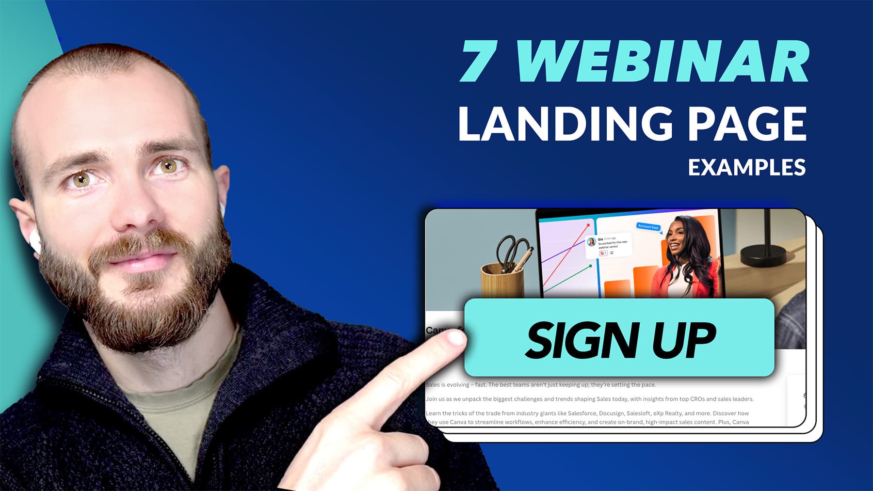
2. Canva - "Create better, close faster"
Som designkungen hamnar Canva också i topp, med en krispig landningssida för sin webinar-serie.

Varför det fungerar:
Fångande titel som tydliggör att detta är en webinar-serie.
Anpassad grafik högst upp som fångar uppmärksamhet.
Tydlig "registrera dig nu"-knapp i kontrasterande färger som sticker ut.
Poäng: Använd anpassad grafik för att fånga uppmärksamhet och berätta din historia; och använd webbinariets titel för att sätta förväntningar.
3. Univid - "Håll webinarier som topp 1 %"
Som ett webinarverktyg vet Univid hur man snabbt sätter ihop landningssidor som konverterar.

Varför det funkar:
Lyfter fram talarna högst upp.
Helt varumärkesanpassad med färger, bilder och logotyp.
FOMO-titel och lätt att dela i sociala medier.
Poäng: Lyft fram webbinariets talare, var trogen ditt varumärke och skapa FOMO.
PS. testa att skapa ditt eget webinar och landningssida med Univid på 60 sekunder - klicka här eller på knappen nedan.
4. Slack - "Så lyckas du med hybridarbete genom samarbete i teamet"
Slack är en frekvent värd för webinarier - både för befintliga och nya kunder. Här är en on-demand-landningssida som de lyckades riktigt bra med.

Varför det funkar:
Låter bilden tala för sig själv.
Låter snabbt besökaren veta "vem webbinariet är för".
Undertitel som utvecklar och kompletterar titeln på ett snyggt sätt.
Poäng: Låt bilderna tala för sig själva och ange snabbt vem målgruppen är som får värde av webbinariet.
5. Lyyti - "Future of Events 2026"
Lyyti är en eventhanteringsplattform som håller ett större årligt webinar - här är vad de gjorde bra med sin landningssida.

Varför det funkar:
Tydlig titel med väl definierad målgrupp - "eventproffs".
Navigering högst upp så det är enkelt att hitta relevant information.
Lyfter snabbt fram praktisk information - svarar på "när" och "var".
Poäng: Var djärv och gör din landningssida lättnavigerad.
PS. Lyyti har direkta webbinarintegrationer, om du håller i webbinarier och vill ha evenemangshantering i världsklass.
6. Unbounce - "Bemästra A/B-testning av landningssidor för högre konvertering"
Unbounce är en SaaS-lösning för att bygga landningssidor - inte nödvändigtvis för webbinarier och event. Men de vet hur man arbetar med konvertering på webbplatser.

Varför det fungerar:
En rak titel som också är SEO-vänlig.
Anpassad grafik som förstärker budskapet.
Kontrasterande färg på CTA.
Takeaway: Håll det enkelt. Tänk på människan först, men ta också hänsyn till SEO (särskilt för on demand).
7. Intercom - "Hur man anammar AI i kundservice år 2026"
Intercom är stora fans av webbinarier och håller dem ofta - både som serier och som större fristående webbinarier för varumärkesmedvetenhet, som det nedan.

Varför det fungerar:
Tydlig titel som drar till sig uppmärksamhet och är centrerad.
Snabb åtkomst med CTA till "Registrera dig" placerad i headern.
Brandad enligt Intercoms profil.
Takeaway: Använd det faktum att du har en titel som är modig och tydlig. Ge snabb åtkomst till registrering och branda hela upplevelsen.
Okej, nu när vi har tittat på några av de bästa exemplen på registreringssidor för webbinarier. Låt oss titta på hur man sätter upp en egen.
Så skapar du en landningssida för webbinar i 3 steg
Att skapa en registreringssida för webbinar måste inte vara svårt.
Följ stegen nedan för att sätta upp din landningssida. Och kolla in videoguiden om hur man gör en webbinarlandningssida med Jonathan här:
1. Skapa en webbinar-design
För att skapa en registreringssida i din egen branding - behöver du först ett webbinar. Skapa ditt webbinar gratis med Univid.

Tryck på knappen "skapa gratis webbinar" nedan eller använd denna länk. Ange sedan bara din URL så skapas en design åt dig.
Om du behöver redigera designen - använd sidopanelen för att ange dina egna HEX-färger, bilder, logotyper osv.

2. Lägg till din text
Designen följer med till registreringssidan. Nu är vi redo att lägga till den text som besökarna kommer att se innan de registrerar sig. Du kan lägga till texten i sidopanelen genom att trycka på "redigera".

A) Du kan lägga till bild, namn och titel på talarna.

B) Även webinartitel och textinnehåll från registreringssidan. Och välja det språk du föredrar.

Tips: Hur du väljer den perfekta webinartiteln
Använd webinartitelgeneratorn för att få inspiration till de bästa titlarna för ditt nästa webinar - beroende på beskrivning och befintlig kunskap om målgruppen. Den baseras på tusentals beprövade exempel och är gratis att använda.

Skapa din nästa webinartitel automatiskt
Skapa titeln på ditt nästa webbinarium på några sekunder. Få förslag på titlar som konverterar och lockar en stor publik.
3. Förhandsgranska resultatet
Låt oss nu förhandsgranska hur landningssidan för vårt webinar ser ut. I sidopanelen under "Åtkomst & registrering" klickar du på "Förhandsgranska".

Okej, ser riktigt bra ut!
4. Lägg till extra formulärfält (valfritt)
Om du vill kan du också lägga till egna fält som de som anmäler sig måste fylla i för att delta.

Kom ihåg att ju mer information du ber om, desto högre blir tröskeln för att gå med. Men det kan vara ett värdefullt sätt att ta reda på:
vad folk vill veta mer om.
vilka de är.
vilka deras färdigheter eller förväntningar är.
Skapa en landningssida i ditt CRM (alternativ)
Du kan också använda ditt CRM - till exempel HubSpot för att skapa en landningssida eller ett formulär.

Som du sedan kan koppla till din webinarprogramvara - för att få engagemangsdata och hålla den liveupplevelsen med.